Modus Digital - Website
I had the privilege of designing and developing a new website for Modus Digital. I started fresh and built the website from the ground up focusing on making it more mobile friendly, minimal and modern. Below is a comparison of the old website next to the new website.
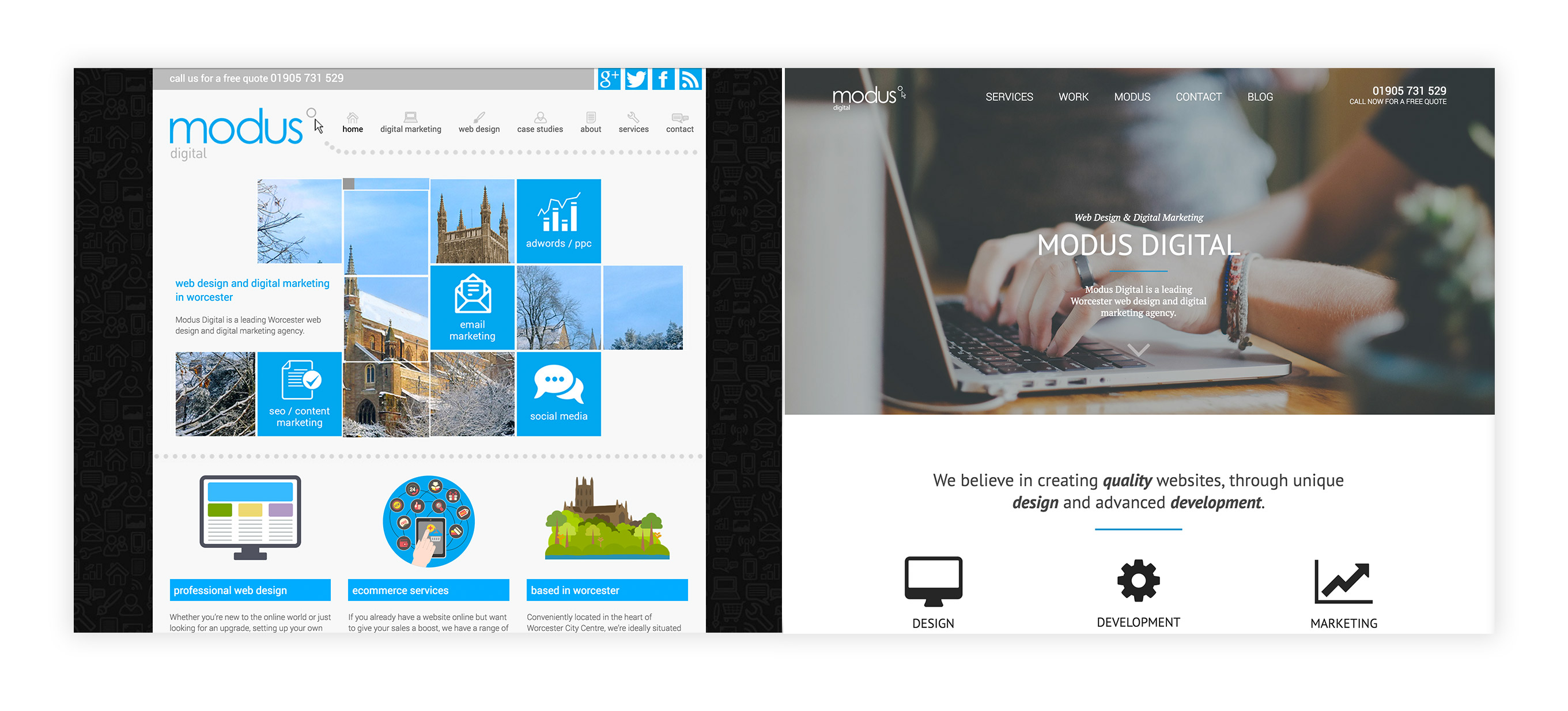
I really enjoyed this project as there was a lot of creative freedom to redesign the existing website. One of my favourite parts of this project was building the animated icons; these icons animate on hover state, but in particular they look great on mobile as they automatically animate when in view, which I feel is a very eloquent answer to the problem of responsive design. I focused on building the website with CSS and jQuery-based small micro-animations throughout, to bring the webpage to life as a viewer interacts with it and to increase depth.
I focused on taking the primary colour from the previous website (and logo) and using it in a simpler way; encompassing that bright colour with other minimal colours and strong imagery. The header navigation, which morphs into a fixed heading, and the footer in this bold blue colour it creates a frame for the website. This works especially well on mobile as the navigation is set into more than just a hamburger-menu; there is a fixed navigation footer bar; which feels more like an app menu than a website navigation, with links to the most important pages.